iPhone Home Screen - May 2023
12 May 2023I recently saw a post from someone where they wrote a blog post mentioned how they like to read about home screens and look back at old screenshots of their own. I also enjoy stumbling upon old screenshots of my phone, whether it’s my home screen or apps that I’m working on. I thought intentionally recording it sounded like a good idea.
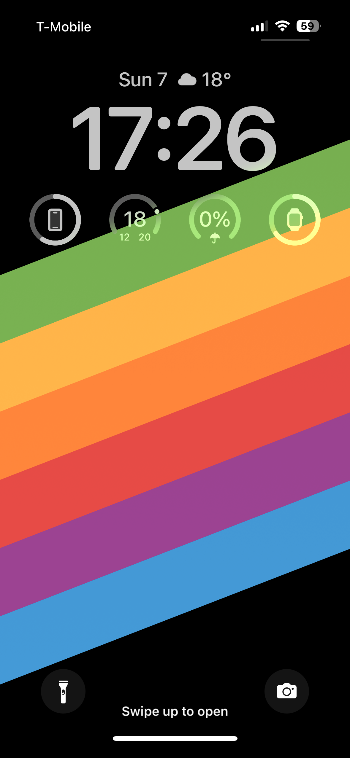
iPhone Lock and Home Screens


I recently read an article about how to optimize your phone to help you focus. Some of my configuration was motivated by the ideas in that article, such as only having one page of home screen, keeping photos and camera in the tab, and keeping apps in alphabetical order. I noticed while writing this article that I actually ended up using the same wallpaper!
Lock Screen
I intentionally keep my lock screen minimal. I only keep widgets on there that provide information that is immediate and relevant: time, battery, and weather.
Earlier in my life, I would have considered keeping more widgets for calendar events, reminders, or notifications. I have recently started thinking of those more as distractions than helpers. Battery and weather information is useful without being distracting. It helps me act accordingly instead of bringing up things that are going on, but perhaps not relevant right now.
Home Screen
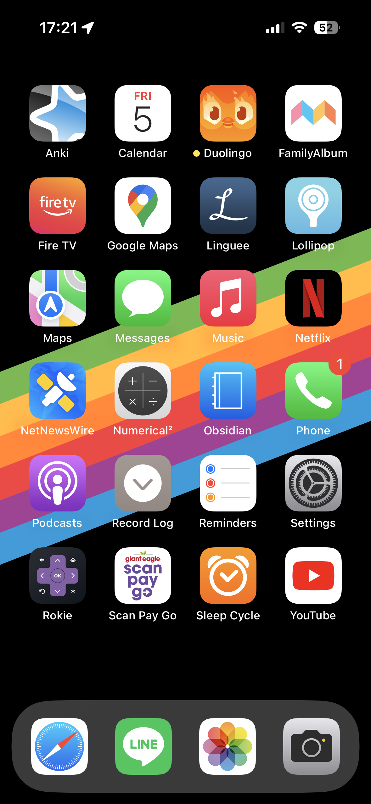
I have a few Focus settings, such as for sleep or work, but this is my standard Personal home screen. I only have one page. This serves both to keep me focused and undistracted from other apps, but also to encourage me to use apps I want to use more. It doesn’t always work, though.
My apps are organized in alphabetical order, which was a suggestion from the article above. It makes it easier to find the apps I want and makes it easier by removing a choice of where I want things to go.
Let’s take a look at the apps:
Dock
The dock is the most accessible area for apps. It’s where your most use apps should go.
The apps I have on there are:
- Safari: The standard web browser for iOS. I have tried others, and used Firefox for a long time. Now that Safari has Tab Groups, and supports certain extensions, it’s good enough to suit my needs.
- LINE: Very popular messaging app in Japan. Nowadays I only use it to message my wife. Because of that, it remains among my most used apps.
- Photos: The standard Apple Photos app. I take more pictures than I did before, and having quick access to them has been better than I was expecting.
- Camera: The standard Apple Camera app. Keeping Photos and Camera on the doc was a recommendation from the article mentioned above. I was skeptical at first, I have found I am more likely to snap a picture and store those memories than I was before.
Up Above
- Anki: Flashcard app with spaced repetition. I could write an entire post about Anki, but I’ll just say that I highly recommend it for anything that needs long-term memorization such as vocabulary in a language you are learning. I have had it since 2010 on my phone, and earlier on my computer. I don’t use it as often as I want, and so it’s on my home screen.
- Calendar: The standard Apple Calendar app. I have tried a few, and I think Fantastical is great. The default app is good enough for my use cases.
- Duolingo: The TestFlight build of Duolingo. I work on this app, and using it is part of my daily routine.
- FamilyAlbum: A photo shared photo album that my family uses to share pictures of our kids with each other.
- Fire TV: Turns my phone into a remote control for our Amazon Fire TV Stick. Helpful if I can’t find the physical one, or I cannot move to go get it.
- Google Maps: I use both Google Maps and Apple Maps, but for different things. Google Maps is usually for discovery, or for storing lists of places I want to go.
- Linguee: A great multilingual dictionary that provides real world usage examples of words. I don’t use it as often as I want, and so it’s on my home screen.
- Lollipop: App used for the camera we have in our son’s room. We’ve had it since he was born, and it has been good.
- Apple Maps: The standard Apple Maps app. While I use Google Maps for discovery, I prefer the UI of actual navigation in Apple Maps.
- Messages: The standard Apple Messages app. I feel like this is pretty self explanatory.
- Apple Music: I recently switched to Apple Music from Spotify. I signed up for Apple One mainly for the increased cloud storage and fitness programs, so it made sense to use Apple Music as well. I also hear they treat artists better than Spotify, but I haven’t looked into that enough to comment on it.
- Netflix: Streaming video. Often used to show my son videos rather than myself. I’ll watch it on the big TV if I’m watching anything.
- NetNewsWire: Great RSS reader for macOS and iOS. I mainly follow tech blogs, but a few other things are on there too.
- Numerical²: Calculator app. Yeah, I know. But believe me, it’s better than the standard one. If for nothing than the fact that it has history and a backspace button.
- Obsidian: Note taking app that is so much more than that. It is my favorite markdown editor. It links notes together. It has many plugins. I have a custom icon and theme for it because I don’t like the default icon or aesthetics.
- Phone: The standard phone app.
- Podcasts: The standard Apple Podcasts app. Similar to the Calendar app, I have tried alternative, but the default app fits my use case. I only listen to a small handful of podcasts anyway, and I don’t need anything fancy.
- Record Log: This is a custom shortcut that I wrote to track when certain things happen. It just records a line in a note in the Notes app. I will probably never do anything with the data, but I have been doing it since 2020, and I have no reason to stop.
- Reminders: The standard Apple Reminders app. I was using Things for a while, but I found myself not using most of the features. The default app is good enough for my use cases. I suppose. Checking it to plan my day still hasn’t become part of my daily routine, so maybe it’s not good enough for my use case, but so far nothing has.
- Settings: The standard settings app. Thinking about it now, I’m not sure why this is on my home screen.
- Rokie: Our TV’s default OS is Roku. This app lets me control the TV from my phone, even if it’s just opening up the Fire TV app. The Fire TV app runs so much faster than the built-in Roku.
- Scan Pay Go: My local grocery store allows you to scan items as you shop and skip the checkout line to use special self-checkout. I love this app. I don’t have to talk to anyone, and I don’t have to wait in line.
- Sleep Cycle: Monitors my sleep and lets me know how well I’m sleeping. I’ve had it since 2010. I also like AutoSleep on my watch. I don’t do anything with the data, but I enjoy looking at it and seeing trends.
- YouTube This probably won’t be on my home screen if it weren’t for my son. I use it to either show him videos or broadcast it to our TV.
That’s what my phone looks like in May 2023. I don’t remember when I set it up like this, but it’s a setup that has been serving me well for a while. I often swing along the pendulum of being fully custom and using power user apps and being simple and standardized, using default apps when I can. Who knows what my home screen will look like the next time I make a post like this? Or when it will be?